Print - Poster Analysis
Exactly the same idea's are used for the second half of the poster they released for the movie. Its exactly the same in every way apart from obviously the image and the name. The effect of the image is slightly different though. In Seth Rogens poster he looks very relaxed and somber. Compared to James Franco who looks ecstatic. I think the reason for this is to show the two more common side effects of marijuana use. One is mellow and chilled and the other is laughing heavily and generally having a good time. What ever you can say about these posters you cant say they don't look happy. Even Seth Rogen (the obviously more docile one) has a wry grin.
 The second poster i have chosen is the Zorro poster. I really liked this poster because its so simple. It doesnt give a lot away about a film, which i like, but at the same time tells you so much (if you want it to) The symbolic "Z" features as the center piece of the poster. I think the entire feel of the poster suggests action. The "Z" looks as though it has been literally carved through the screen igniting upon contact. This would suggest to anyone with a brain in there head that this is not going to be a romcom, its clear the genre of the film, action.
This isnt a full release poster but a teaser poster. It fills its role with perfect effect..
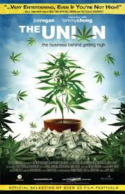
This poster is a little more unconventional in its approach, it screams at you what its purpose is immediately Unfortuantely while this approach is refreshing it may be a little obnoxious. I think that the bluntness (pun intended) of the poster may put more reserved audience members off.
All that aside i think the poster gets its point across well. You can see what the director is trying to tell you from it. The images couples with the name of the film essentially spells out to you what you are going to see.
The poster also comes across quite laid back in my opinion, which again indicates to the style of documentary your going to be watching.
The second poster i have chosen is the Zorro poster. I really liked this poster because its so simple. It doesnt give a lot away about a film, which i like, but at the same time tells you so much (if you want it to) The symbolic "Z" features as the center piece of the poster. I think the entire feel of the poster suggests action. The "Z" looks as though it has been literally carved through the screen igniting upon contact. This would suggest to anyone with a brain in there head that this is not going to be a romcom, its clear the genre of the film, action.This isnt a full release poster but a teaser poster. It fills its role with perfect effect..
This poster is a little more unconventional in its approach, it screams at you what its purpose is immediately Unfortuantely while this approach is refreshing it may be a little obnoxious. I think that the bluntness (pun intended) of the poster may put more reserved audience members off.
All that aside i think the poster gets its point across well. You can see what the director is trying to tell you from it. The images couples with the name of the film essentially spells out to you what you are going to see.
The poster also comes across quite laid back in my opinion, which again indicates to the style of documentary your going to be watching.
No comments:
Post a Comment